PY Corporate Brand Identity
The complete, official design system for Peace by Youth — expanded samples and usage rules covering logo, colour, typography, iconography, publications, digital, social, events, co-branding, data visualization, accessibility, humanitarian communication, file management, governance and release checklists.
Source analysis and final alignment
This identity consolidates PY's strategic visuals, profile assets and production rules into one professional system that is recognizable, usable and safe across documents, proposals, reports, presentations, events and digital channels.
| Source reviewed | What was retained | Final alignment decision |
|---|---|---|
| Strategic Plan 2024-2030 | Triangle mosaics, pale background, navy/teal hierarchy, circular diagrams, thematic icons | Use as the visual foundation for strategic and programmatic materials. |
| PY Organizational Profile 2026 | Curved photo bands, H.O.N.E.S.T.Y values, office/registration details, impact/stat sections | Use as the profile/report design language; refine spacing and consistency. |
| Logo Definition | Dove symbol, PY initials, blue and deep navy master colours, full-name logo rules | Treat supplied master artwork as protected; never rebuild or recolour beyond variants. |
| PY BI production document | Governance, file management, approval, accessibility, safeguarding, crisis communication | Retain as corporate operating standard. |
| PY Brand Identity 2026 guide | Cleaner palette, typography, layout rules, social/digital guidance | Use as quick visual guidance and convert into practical samples. |
- Modern nonprofit identity, not a decorative campaign style
- Youth-led and community-rooted with international credibility
- White space, strong hierarchy and accessible text
- Icons and graphics support meaning, not decoration
- Do not make the commitment infographic a master identity mark
- Do not use UN blue as PY's default icon colour
- Do not overfill documents with icons or logos
- Do not create new project logos when a program tag is enough
Before-release sample alignment check
| Check | Example of correct application |
|---|---|
| Logo | Full-colour PY logo on white or light mist; white reverse on navy. |
| Colour | Navy/blue hierarchy with one accent: teal for general, thematic colour for program. |
| Typography | Lato/Roboto-style clean sans hierarchy; Noto for Urdu/Sindhi. |
| Iconography | Recoloured PY/UN icons; paired with labels. |
| Layout | Curved bands, clean grids, circular photo frames, pill labels and footer strips. |
Brand foundation
The promise, values and personality every PY communication must reinforce.
Mission
Participation, Empowerment and Association of Change Enablers — PEACE.
Vision
A Prosperous Peaceful Pakistan.
Tagline
Empowering Youth, Shaping Futures.
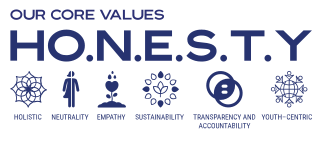
Core values — H.O.N.E.S.T.Y.
Holistic, Neutrality, Empathy, Sustainability, Transparency & Accountability, Youth-centric.
Brand idea
Youth leading peaceful, inclusive and sustainable change.
Brand promise
PY creates credible spaces, skills, partnerships and opportunities through which young people and communities can shape lasting change.
Brand personality sample
| Trait | Looks like | Sounds like |
|---|---|---|
| Youthful | Fresh colour accents, authentic youth imagery, clear call-to-action | Young people are leading solutions in their communities. |
| Professional | Structured grid, verified data, clean partner bands | During the reporting period, PY facilitated... |
| Community-rooted | Local photos, accessible language, community context | Together with community members, PY facilitated... |
| Accountable | Sources, dates, consent, feedback contacts | Data is based on verified attendance records from... |
Youth leading peaceful, inclusive and sustainable change.
PY brand essenceLogo system
The official logo combines a stylized peace dove with the initials PY. The master colours are PY Blue #0071BC and Deep Navy #383658. Always use supplied vector or approved high-resolution files — never rebuild or recolour beyond approved variants.

Official master marks and use cases
| Variant | Use | Background | Minimum |
|---|---|---|---|
| Primary initials lockup | Default mark for reports, banners, stationery and internal templates | White, PY Mist, very light neutral | 72px high digital / 18mm print |
| Full-name lockup | New audiences, donor-facing profiles, formal partner material | White/light neutral or reverse on navy | 140px wide digital / 35mm print |
| White reverse | Dark navy, blue or controlled dark photography | Navy/blue fields only | Same as master mark |
| One-colour navy or black | Stamps, embossing, single-colour print, photocopying | White/light background | Same as master mark |
Logo usage samples
Correct on whiteCorrect reversed on navyCorrect on PY MistClear space system
Define X as the height of the PY initials. Keep at least 1X clear space around the logo. For signage, backdrops and co-branding bands, use 1.5X where possible. Never place text, partner marks, icons, page edges or photo details inside the clear-space zone.
| Never do this | Reason |
|---|---|
| Stretch, compress, rotate or skew the logo | Destroys protected proportions. |
| Rebuild PY letters using another font | Creates an unofficial logo. |
| Apply drop shadows, bevels, glows or outlines | Weakens professional consistency. |
| Place the logo directly over faces or busy photographs | Reduces legibility and dignity. |
| Use the commitments infographic as the identity mark | It is only a section infographic, not a master logo. |
Colour system
PY colour use is built around trust, credibility, youth energy and clarity. White/neutral space should remain dominant; navy and blue carry recognition; teal and thematic colours add movement and program identification.
Core master brand palette
#0071BC
Primary recognition, links, highlights.
#383658
Authority, dark backgrounds, headings.
#169E9A
Participation and sustainability.
#FFFFFF
Clean canvas.
#F3F7FA
Soft background and cards.
#BEB0D6
Safeguarding panels and quiet soft accents.
Supporting youth-energy palette
#3BA7D8
Digital optimism.
#F5B700
Youth opportunity.
#E86A5A
Campaign warmth.
#7556A6
Inclusion and gender.
#3E9B6F
Climate and environment.
#E77A2B
Community enterprise.
Neutral and status palette
#1D2433
Body text.
#475467
Secondary text.
#E4E7EC
Dividers.
#278A5B
Completion.
#C17D00
Caution.
#D64545
Critical risk.
Colour ratios and contrast rules
Rule: Do not use UN blue as PY's default icon colour, and never use red/warning decoratively.
Typography system
PY typography must be readable before it is decorative. Use a clean sans-serif family — Lato/Roboto for English — and a Noto Arabic-script family for Urdu and Sindhi. Keep local-language text equal in dignity and visual importance.
DISPLAY / CAMPAIGN TITLE
Chapter or page title
Major section
Subsection
Peace by Youth communicates in clear, active and respectful language. Body copy should be easy to read in print, mobile screenshots and accessible PDF exports.
Photo: Youth leadership dialogue, Jacobabad, June 2026. Consent-linked image record available.
Typography usage table
| Role | Digital | Usage | |
|---|---|---|---|
| Display | 30-42pt | 48-64px | Campaign covers and report titles |
| H1 | 22-28pt | 36-44px | Chapter/page title |
| H2 | 16-20pt | 28-32px | Major section |
| H3 | 12-15pt | 20-24px | Subsection |
| Body | 9.5-11pt | 16-18px | Long-form reading |
| Caption | 8-9pt | 13-14px | Captions, credits, metadata |
| Label | 8-10pt | 12-14px | Tags, form labels, controls |
- Use sentence case for most headings
- Use all caps only for short labels
- Use real bold/italic, not distortion
- Keep line length near 45-75 characters
- Long all-cap headings
- Too many typefaces on one page
- Script fonts for body/data/legal text
- Small text over patterned backgrounds
Iconography and illustration
Icons should help users scan and understand — they are not decoration. UN-style icons are recoloured into PY palette colours for PY documents, while official UN/partner marks must follow their own rules when used as logos.
PY strategic icon set — six commitments


PY-coloured humanitarian and program icon library samples






Strategic illustration samples

Our Way
Innovation / collaboration
Core Values
Diversity and inclusion
Thematic Areas
Socio-economic model

Programmatic Pillars
Strategic objectives
- Use one colour per icon cluster
- Pair every unfamiliar icon with text
- Keep stroke weight consistent
- Use 24x24 or 48x48 grids
- Use realistic, respectful people; represent diversity without tokenism
- Mixing multiple icon libraries in one document
- Cartoon stereotypes and unlicensed styles
- Turning SDG icons into background decoration
- Recolouring official SDG icons
Graphic language and layout
The PY layout language is professional, spacious and modular — clean white surfaces with navy/teal bands, circular photos, pill labels, triangle mosaics and connected diagrams. Each design should have one dominant message and one clear visual system.
Core graphic devices
| Device | Meaning | Sample use |
|---|---|---|
| Flight curve | Peace, movement, forward direction | Report covers, section dividers, social banners |
| Participation nodes | Networks, shared action, partnerships | Coalition maps, digital systems, process diagrams |
| Open frame | Transparency and access | Quotes, calls to action, case studies |
| Community mosaic | Diversity and collective contribution | Impact summaries and strategic documents |
| Horizon band | Stability and future direction | Footers, end slides, event backdrops |
Layout component samples
Title block
Logo + title + subtitle + date/location.
Impact card
Metric + unit + period + source.
Quote card
Quote + attribution + consent status.
Safeguarding panel
Report channel + confidentiality note.
Sample grid behaviour
| Format | Margins / safe zone | Grid | Use |
|---|---|---|---|
| A4 report | 18-22mm | 6-column modular | Reports, profiles and manuals |
| Square social | 64-96px | 6 columns | Posts and carousel cards |
| 16:9 slide | 5-7% safe area | 12 columns | Presentations and stage screens |
| Event banner | 10% top/bottom safe zone | 3 zones | Logo, event title, partner band |
Photography, video and consent
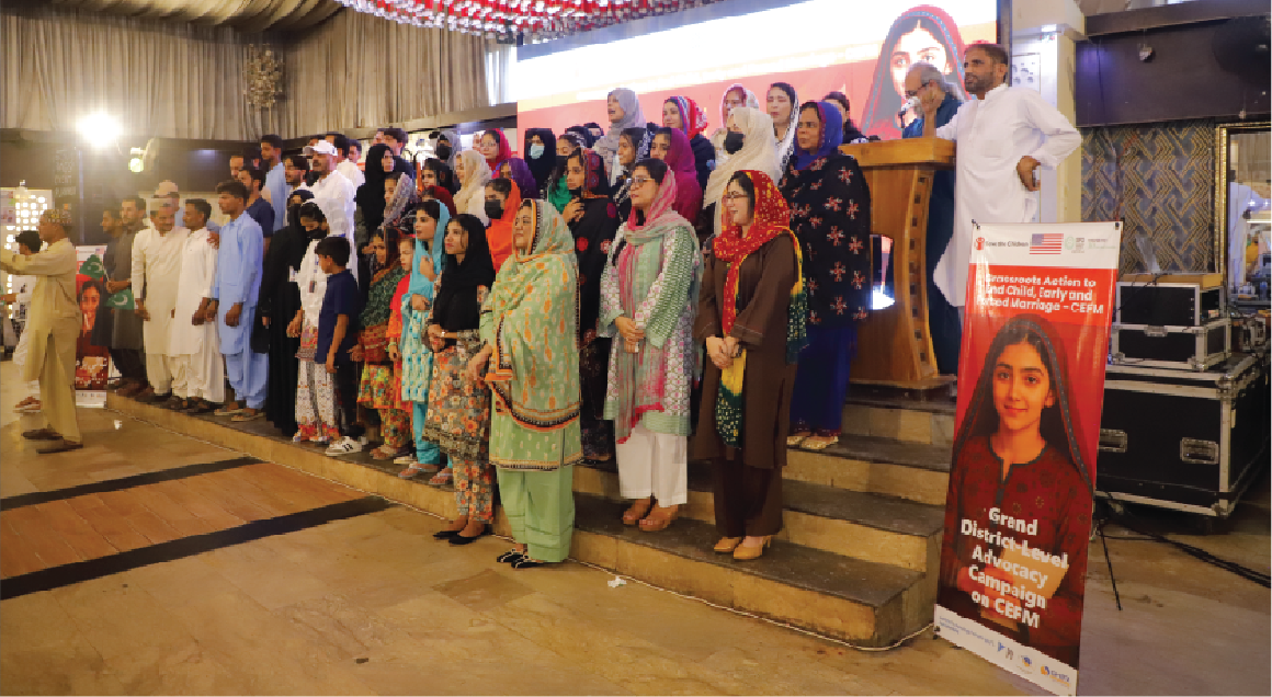
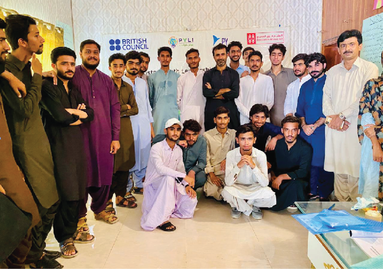
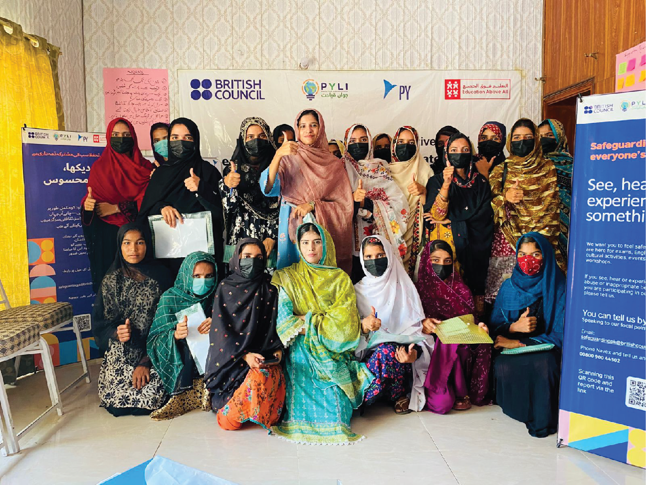
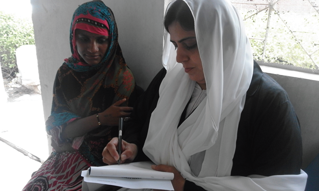
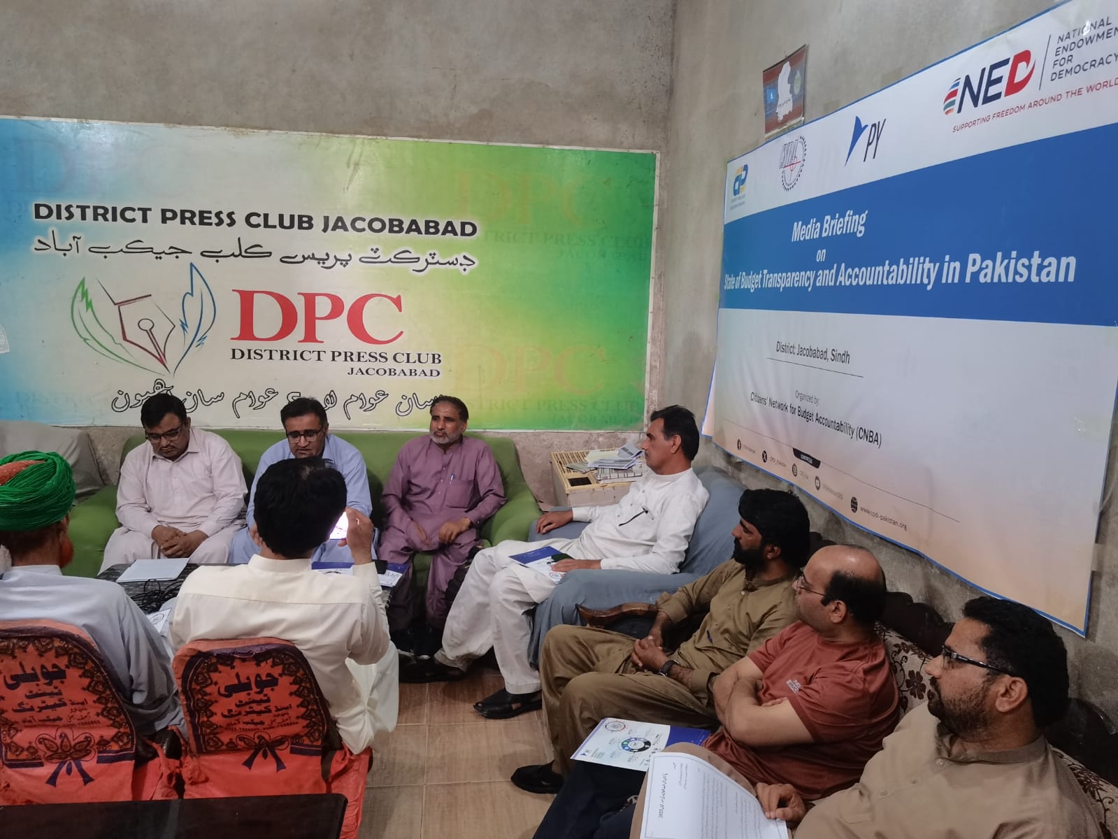
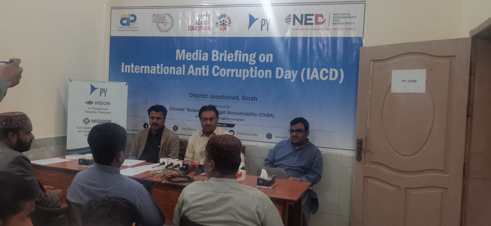
Photography and video are powerful because they show real people. They are also risky if dignity, privacy, consent and context are not protected. PY must prioritize safety and agency before visibility. Samples below are drawn directly from projects currently in implementation.
Video production standards
| Video type | Recommended structure | Brand elements |
|---|---|---|
| 30-second social reel | Hook 3 sec → activity 15 sec → quote/stat 7 sec → CTA 5 sec | Logo safe area, captions, short title, final contact |
| 2-minute project update | Context → what happened → participant voice → result → next step | Lower-thirds, date/location, partner band, consent log |
| Emergency video | Verified risk → action now → where to get help → update time | High contrast text, no music, no speculation |
Consent system examples
| Situation | Minimum requirement | Caption rule |
|---|---|---|
| Identifiable adult | Informed consent appropriate to channel and duration | Use name only if consented; otherwise group caption. |
| Child/adolescent | Guardian consent plus age-appropriate assent | Avoid full names; assess risk before publication. |
| Sensitive case/survivor | Specialist risk review and explicit consent; anonymization preferred | Do not identify without clear necessity. |
| Crowd/public event | Visible notice and practical opt-out; portraits need individual consent | Use general event caption and date/location. |
Caption ID sample: PY-CONSENT-2026-JCD-0001 — Youth participants, Youth Leadership Dialogue — channel permission: report, website, social media, donor presentation — review after two years or upon withdrawal request.
Verbal identity and editorial style
PY voice should be warm, clear, rights-based and evidence-led — respectful of local communities while remaining credible for donors, government, networks and partners.
Core message framework
| Who we are | Peace by Youth is a youth-led, community-rooted nonprofit organization. |
| Why we exist | We believe young people and communities can lead peaceful, just and sustainable change. |
| What we do | We build participation, skills, partnerships and platforms across youth empowerment, social justice, peace and sustainability. |
| How we work | Participatory, accountable, inclusive, innovative and community-driven. |
| What changes | Young people gain voice and opportunity; communities strengthen cohesion, resilience and ownership. |
Tone by channel
| Context | Tone | Sample opening |
|---|---|---|
| Community invitation | Warm, direct, practical | Join us on Tuesday to discuss youth-led community action. |
| Donor report | Evidence-led, concise | During the reporting period, PY facilitated three sessions with 126 participants. |
| Advocacy | Confident, rights-based | Young people must have a meaningful role in decisions that affect their future. |
| Safeguarding | Calm, protective | Your safety matters. You can report concerns confidentially through... |
| Emergency notice | Immediate, factual | Move away from the affected area and follow official guidance issued at... |
| Youth campaign | Energetic, respectful | Your idea can shape what happens next. |
Editorial samples: better wording
| Avoid | Use instead | Why |
|---|---|---|
| We gave help to poor beneficiaries. | PY worked with community members to improve access to essential services. | Dignity and agency. |
| This project changed thousands of lives. | The project reached 1,240 participants; outcome data will be verified through follow-up. | Evidence and honesty. |
| Victims were photographed during distribution. | Participants received support through a consent-safe process. | Protection and privacy. |
| Youth are the future. | Young people are present leaders and change enablers. | Youth-centric. |
Thematic and program architecture
PY operates through one master brand. Programs may use thematic colours, tags, icons and layout patterns, but they must not become separate unrelated identities. The PY logo, typography, and navy/blue/teal hierarchy must remain visible.
Architecture levels
| Level | Identity rule | Example |
|---|---|---|
| Master brand | PY logo is primary and dominant | Peace by Youth |
| Master-branded program | PY logo + program name; thematic colour accent | Peace by Youth | Youth Leadership Program |
| Endorsed initiative | Initiative mark may lead; PY endorsement required | Youth Resource Hub — An initiative of Peace by Youth |
| Co-branded project | Role labels and contract-aware logo band | Implemented by PY with [Partner] |
| Coalition / platform | Coalition identity leads; PY role stated accurately | Coordinated by Peace by Youth |
| Emergency response | PY master brand + response descriptor | PY Flood Response 2026 |
Approved endorsement lines
Use only when PY created, owns and governs the initiative.
PY has primary strategic leadership but others contribute.
PY provides administrative, digital or convening support.
PY manages collective processes for a network or coalition.
PY is formally responsible for delivery.
PY contributes resources or technical support without leading.
10A — Program theme system: colours and messaging anchors
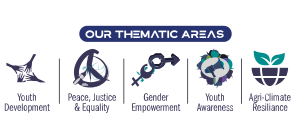
Skills, leadership, employability and civic participation
#F5B700
Peace education, rights, dialogue and conflict transformation
#2474B5
Women's leadership, protection and agency
#7556A6
Campaigns, public education and policy influence
#E86A5A
Climate action, conservation and sustainable agriculture
#3E9B6F
Digital literacy, data and innovation
#3BA7D8
Education, livelihoods, infrastructure and local systems
#E77A2B
Health, psychosocial wellbeing and care
#168F86
Urgent notices and lifesaving information only
#D64545
10B — Program architecture examples
| Scenario | Correct identity construction | Example |
|---|---|---|
| Ongoing youth program | PY logo + program name + Sun tag | Peace by Youth | Youth Leadership Program |
| Digital platform owned by PY | Platform name + endorsement line | Youth Resource Hub — An initiative of Peace by Youth |
| Climate coalition coordinated by PY | Coalition identity + accurate role line | Pakistan Climate Coalition | Coordinated by Peace by Youth |
| Emergency response | PY logo + response descriptor + red alert only where needed | PY Heatwave Response 2026 |
| Donor-funded project | Project title + role label + partner band | Implemented by Peace by Youth with support from [Donor] |
| Field campaign | PY master brand + campaign headline + thematic accent | Peace in Action | Community Dialogue Series |
- Short, pronounceable and searchable
- Culturally respectful in English and local language
- Avoid acronyms until duplication is checked
- Use a program descriptor when needed
- Do not create decorative project logos for every activity
- Do not recolour the PY logo by program theme
- Do not place donor logos above PY unless contractually required
- Do not hide PY role in coalition/platform materials
Publication system
Publications are where PY's credibility is built. Each document must have a clear purpose, correct logo usage, strong hierarchy, accurate evidence, accessible structure and appropriate partner visibility.
Publication families and required elements
| Family | Cover hierarchy | Required closing material |
|---|---|---|
| Annual / organizational report | PY logo, report title, year, hero image or graphic device | Credits, contacts, legal information, feedback and safeguarding channels |
| Project report | PY + project title + donor/partner band | Results, learning, finance where applicable, sources and contacts |
| Research / assessment | Title, geography, date, methodology descriptor | Methodology, limitations, references and ethics statement |
| Policy brief | Issue-led title and one thematic accent | Recommendations, evidence notes and contact |
| Case study | Human-centered title and consent-approved image | Context, change, contribution, evidence and learning |
| Fact sheet | Strong title, key statistic and program tag | Source notes and CTA |
| Training manual | Course title, audience, version and thematic code | Facilitator notes, accessibility and revision details |
Example cover structures
Interior page example requirements
| Element | Specification |
|---|---|
| Running header | Publication title or chapter, 8-9pt, gray or navy. |
| Page number | Outer footer or centered footer; consistent throughout. |
| Chapter opener | H1, short introduction, thematic tag and one visual. |
| Tables | Header row repeated, units in headings, source note beneath. |
| Figures | Numbered title, alt text, source and explanatory note. |
| References | Consistent citation style selected for the publication. |
Stationery and official communication
Stationery carries the formal identity of PY. It should be clean, controlled and legally accurate. Do not overload official materials with decorative graphics or unnecessary partner logos.
| Item | Core specification |
|---|---|
| Letterhead | A4; logo at top; contact/legal footer; 20-25mm margins; one-page and continuation-page versions. |
| Memo | A4; To, From, Date, Subject, Reference; controlled footer. |
| Agenda | Meeting title, purpose, date/time, location/link, facilitator, items and owners. |
| Minutes | Attendance, decisions, actions, owner, deadline and approval status. |
| Business card | 90x50mm or local standard; name, role, email, phone, web; no excessive logos. |
| Envelope | DL/C5/C4 variants; logo and return address; postal safe zones. |
| Certificate | Recipient, achievement, project/event, date, authorized signatures and verification reference. |
| ID card | Photo, name, role, validity, ID number, emergency contact and safeguarding note as appropriate. |
12A — Email signature working sample
Email signatures must be readable as live text. Do not use an image-only signature — recipients cannot copy phone numbers, screen readers cannot read it properly, and it may be blocked by email clients.
Peace by Youth (PY) — Participation, Empowerment and Association of Change Enablers
M: +92 333 3405055 | E: info@py.org.pk | W: www.py.org.pk
Head Office: First Family Lane, Jacobabad, Sindh
Safeguarding/feedback: feedback@py.org.pk | Please consider the environment before printing this email.
- Use live text and accessible links
- Keep optional logo under 180px wide
- Include current role and office only when needed
- Use confidentiality or safeguarding line for formal email
- Large image-only signatures
- Too many logos or badges
- Inspirational quotes in official email
- Outdated phone/address details
Presentation system
Presentations should feel like PY: clear, energetic and credible. Use 16:9 by default, one idea per slide and high-contrast text suitable for projectors.
| Slide type | Required structure | Example use |
|---|---|---|
| Title | Logo, presentation title, subtitle, date and presenter | Project launch or donor briefing |
| Section divider | Short chapter title, graphic device, thematic colour | Transition between agenda sections |
| Content | One idea, concise heading, two content zones maximum | Training points or activity summary |
| Data | Chart, key finding, source and interpretation | MEAL review or donor result |
| Image story | Approved image, short caption and one message | Story of change |
| Quote | Consent-approved quote, attribution and context | Participant voice |
| Process | Three to seven steps with icons and sequence | Implementation timeline |
| Partner | Purpose, roles and optically balanced partner band | Co-branded briefing |
| Closing | Summary, call to action, contact details and logo | Final slide |
Sample slide titles by context
| Context | Recommended slide title style |
|---|---|
| Donor update | What changed during the reporting period |
| Community session | Today's discussion and how to participate |
| Training | Learning objectives for this module |
| Advocacy event | Why youth voice matters in local decisions |
| Emergency coordination | Verified risks, response gaps and next actions |
Events and environmental branding
Backdrops, rollups, banners, signage and sustainable production for PY events and field visibility.
| Asset | Standard | Key rule |
|---|---|---|
| Backdrop | Typical 3x2m or venue-specific | Event title leads; PY logo in top brand zone; partner band separated below. |
| Roll-up banner | 85x200cm | Logo/title in top third; CTA/contact at eye level. |
| Workshop banner | 1600x800px digital master or print equivalent | Specific event title, date, venue and thematic code. |
| Name badge | 90x60mm | Name large; role/organization secondary. |
| Directional sign | A3/A4 or venue-specific | Arrow, destination and icon; high contrast. |
| Photo wall | Venue-specific | Controlled repeated marks; no distortion or overcrowding. |
- Reusable modular backdrops
- Avoid dates on reusable assets
- Recyclable or responsibly sourced materials
- Water-based/lower-impact inks where feasible
- Disposable PVC when alternatives exist
- Heavy full-bleed ink without need
- Printing excessive quantities
- Unarchived dimensions that force reprinting
Co-branding and partnership visibility
Partner visibility must be fair, accurate and contract-aware. PY should protect its logo integrity while respecting donor and partner requirements.
| Relationship | Recommended hierarchy |
|---|---|
| PY-led and supported by donor/partner | PY logo primary; donor/partner band labelled "Supported by" or contract-required wording. |
| Joint implementation | Optically equal implementer marks; role labels above or beneath the band. |
| Donor-led requirement | Follow contractual rules while protecting PY clear space. |
| Coalition | Coalition mark primary; member marks separate; PY role stated accurately. |
| Government collaboration | Use exact approved government emblem files and protocol. |
| Community partner | Recognize based on role, not only financial value. |
Partner band sample
| Label | Meaning |
|---|---|
| Led by | Primary strategic leadership |
| Implemented by | Formal delivery responsibility |
| In partnership with | Shared collaboration |
| Supported by | Financial, technical or in-kind support |
| Funded by | Funding relationship only |
| Coordinated by | Secretariat or collective coordination |
| Hosted by | Administrative, digital or venue hosting |
Data visualization and impact communication
Every public statistic should be meaningful, proportionate and verifiable: value + unit + who/what + location where relevant + time period + source or method + interpretation.
| Example statistic | Why it works |
|---|---|
| 420 young people completed digital-skills sessions in Jacobabad between January and May 2026 (PY attendance records). | Includes value, unit, group, location, period and source. |
| 91.67% of audited expenditure was spent on program services in FY2025 (audited financial statements). | Includes percentage, base context and source. |
| 15 projects reached 36,784+ participants across four districts, based on project records up to 2026. | Shows scale and source limitation. |
Chart selection guide
| Question | Preferred chart | Example |
|---|---|---|
| Compare categories | Bar chart; horizontal for long labels | Participants by program area |
| Change over time | Line chart with direct labels | Monthly outreach trends |
| Part of whole | 100% stacked bar; pie only for 2-5 simple categories | Budget spend categories |
| Distribution | Histogram, box plot or dot plot | Age distribution of participants |
| Relationship | Scatter plot with cautious interpretation | Training hours vs assessment score |
| Geography | Map only when relevant and safe | District-level coverage |
Sample data card layout
Website and digital design system
Responsive components, tokens, accessibility and low-bandwidth design for PY digital platforms.
| Token | Value / rule |
|---|---|
| Primary colour | PY Blue #0071BC |
| Primary dark | Deep Navy #383658 |
| Accent | PY Teal #169E9A |
| Text | Ink #1D2433 |
| Surface | White / #F8FAFC |
| Border | #E4E7EC |
| Radius | 8px standard; 16px feature cards |
| Spacing | 4, 8, 16, 24, 32, 48, 64px |
| Body type | 16-18px; user scaling supported |
| Focus indicator | At least 2px and clearly visible |
Core digital components
| Component | Requirements |
|---|---|
| Header | Logo, accessible navigation, language option, clear CTA and mobile menu. |
| Hero | One message, supporting sentence, one or two actions and optimized visual. |
| Program card | Thematic tag/pattern, title, short description and link. |
| Impact card | Metric, context, source and accessible reading order. |
| Story card | Consent-approved image, title, summary and meaningful link. |
| Safeguarding block | Visible reporting route and privacy reassurance. |
| Form | Persistent labels, instructions, error summary and privacy note. |
| Footer | Contact, offices, legal, safeguarding, privacy, accessibility and social links. |
Digital page sample structure
| Page section | Sample content |
|---|---|
| Hero | Empowering Youth, Shaping Futures + two action buttons: Partner with us / Explore programs |
| Programs | Cards for Youth, Peace, Gender, Climate, Digital, Community |
| Impact | Three data cards with source notes |
| Stories | Consent-safe stories with meaningful links |
| Safeguarding | Report concern / feedback channels |
| Footer | Offices, social links, privacy, accessibility, feedback |
Accessibility, safeguarding and inclusion
A professional identity must be usable by more people, not only visually attractive. Accessibility and safeguarding are identity standards, not optional extras.
| Area | Mandatory requirement |
|---|---|
| Contrast | 4.5:1 body text; 3:1 large text and essential graphics. |
| Typography | Readable size, line spacing, line length and no information in all caps. |
| Colour | Never the only carrier of meaning. |
| Images | Alt text or captions; decorative images marked accordingly. |
| Video | Captions; transcript for substantive content. |
| Documents | Heading styles, reading order, table headers and meaningful links. |
| Digital | Keyboard access, focus visibility, reflow and user scaling. |
| High contrast, matte stock where practical and alternate formats on request. |
- People in leadership and decision-making roles
- Real diversity according to participation
- Persons with disabilities as participants and experts
- Women and girls with agency and voice
- Using one person to represent an entire group
- Accessibility aids as inspirational props
- Pity-based narratives
- Publishing sensitive identity details without need
Safeguarding content sample: Your safety matters. You can share feedback or report a safeguarding concern through feedback@py.org.pk or the official reporting number. Reports are handled respectfully and only shared with people who need to act on them.
Humanitarian and emergency communication
Emergency communication must be clear, time-bound, verified and protective. It should tell people what to do now, what not to do, where to get help and when the next update will come.
Location: Jacobabad urban and peri-urban areas
Issued: 11 June 2026, 10:00 AM
Action now: Avoid outdoor work during peak heat, drink safe water, check elderly people and children, and contact health services if symptoms appear.
Verified source: PY field team and local coordination update. Next update: 4:00 PM.
Crisis approval workflow
| Stage | Owner | Output |
|---|---|---|
| Verify | Program lead + specialist | Confirmed facts, unknowns and sources |
| Risk review | Executive lead + safeguarding/security/legal | Harm, privacy and reputational assessment |
| Draft | Communications lead | Holding statement or full update |
| Approve | Authorized executive | Time-bound approved wording |
| Publish | Authorized channel owner | Consistent release across selected channels |
| Monitor | Communications + program | Questions, misinformation and stakeholder response |
| Update / close | Authorized executive | Corrected update, next steps and record |
File management and production standards
Brand consistency depends on asset control. Every final output should have an editable source, approval status and archived final version.
| Purpose | Preferred | Do not use |
|---|---|---|
| Master logo | SVG, EPS, editable PDF | JPEG screenshots or traced copies |
| Office documents | DOCX, PPTX, XLSX templates | Flattened images as editable content |
| Print production | Press-ready PDF with bleed and embedded fonts | Low-resolution office PDF |
| Web image | WebP/AVIF plus fallback PNG/JPEG | Unoptimized camera originals |
| Transparent mark | SVG or PNG | JPEG |
| Photography archive | Original RAW/JPEG plus edited master | Social-media downloads |
| Data | CSV/XLSX plus source notes | Image-only tables |
File naming convention
PY_[Program-or-Unit]_[Asset-Type]_[Topic-or-Event]_[Language]_[YYYYMMDD]_v##_[Status].[ext]
Example: PY_YouthLeadership_EventBanner_Jacobabad_EN_20260611_v03_APPROVED.pdf
Folder structure
Brand governance
Ownership, approvals, exceptions and quality control across the organization.
| Role | Responsibility |
|---|---|
| Board / governing authority | Approve fundamental identity changes and protect institutional integrity. |
| Executive leadership | Authorize releases, exceptions, crisis communication and major co-branding. |
| Communications lead | Custodian of assets, templates, editorial standards and quality control. |
| Program teams | Provide accurate content, context, consent and timely review. |
| MEAL function | Verify data, indicators, evidence and limitations. |
| Safeguarding focal person | Review sensitive imagery, stories, reporting information and risk. |
| IT / digital lead | Implement design tokens, accessibility, security and technical quality. |
| Office / regional leads | Apply standards locally and prevent unofficial variations. |
Approval matrix
| Material | Content approval | Brand approval | Additional approval |
|---|---|---|---|
| Routine social post | Program owner | Communications | Safeguarding if people/sensitive topic |
| Project report | Program lead + MEAL | Communications | Donor/partner if required |
| Research publication | Technical lead | Communications | Ethics/legal/safeguarding as relevant |
| Event banner | Event lead | Communications | Partner visibility confirmation |
| Safeguarding material | Safeguarding focal person | Communications | Executive where policy requires |
| Emergency notice | Response lead | Communications | Authorized executive/security |
| Logo exception / new identity | Executive sponsor | Communications custodian | Board-designated authority |
| Website release | Content owner | Communications | IT + accessibility/security review |
Exception process sample
Implementation and release checklists
Everyday workflow and final checks before publication.
90-day implementation sequence
| Period | Actions |
|---|---|
| Days 1-15 | Approve authority page; freeze master assets; create controlled folders; issue quick reference. |
| Days 16-30 | Train leadership, communications, program, MEAL, safeguarding, IT and office focal points. |
| Days 31-45 | Replace letterhead, presentations, social templates, event banners and email signatures. |
| Days 46-60 | Update website components, social profiles, downloadable documents and partner packages. |
| Days 61-75 | Migrate active program materials and archive superseded assets. |
| Days 76-90 | Complete quality review, resolve exceptions and confirm organization-wide adoption. |
Universal release checklist
Quick reference and formal adoption
Essential rules on one operational page.
| Area | Remember |
|---|---|
| Logo | Use approved master artwork; 1X clear space; never recolour, distort or rebuild. |
| Colour | White/neutral canvas + Navy/Blue hierarchy + Teal or one thematic accent. |
| Type | Readable sans-serif; Noto for Urdu/Sindhi; sentence case. |
| Images | Agency, dignity, consent, accurate context and alt text. |
| Language | Plain, active, inclusive, accurate and evidence-led. |
| Partners | Use role labels and optically balanced logo bands. |
| Data | Value + context + period + source + limitations. |
| Accessibility | Contrast, headings, reading order, captions, keyboard and alternate formats. |
| Safeguarding | Safety and privacy override publicity. |
| Files | Use controlled templates, clear version status and archived approved sources. |
Youth leading peaceful, inclusive and sustainable change.
Brand essenceFormal adoption
| Approval role | Name | Signature | Date |
|---|---|---|---|
| Executive Director | |||
| Chairperson / authorized Board representative | |||
| Communications custodian |
Peace by Youth (PY) | Participation, Empowerment and Association of Change Enablers — PEACE | www.py.org.pk | info@py.org.pk
Social media and digital identity
Social content should be fast to understand and easy to share responsibly. Use one strong headline, one short supporting line, one action point and consistent PY footer/contact placement.
Caption examples